Design Thinking-5 easy ways to make you a Pro
January 23, 2023
January 23, 2023
Tell us about your project right here, or send us an email at hello@penonpaper.in
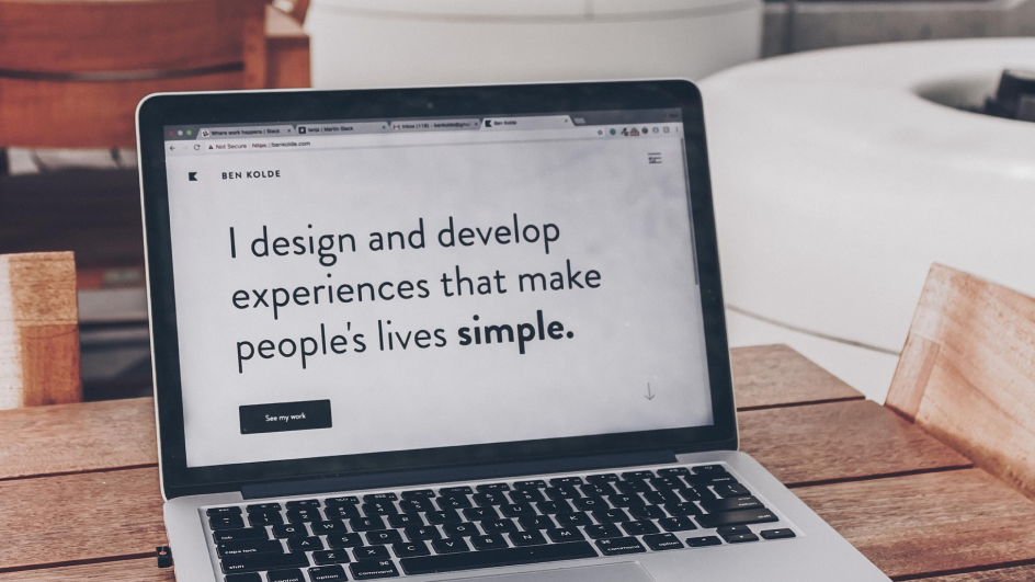
"Design can be art. Design can be aesthetics. Design is so
simple, that's why it is so complicated.”
- Paul Rand,
graphic designer
Some were born with the designing skills or just got lucky.
But most designers learned certain skills and habits that
keep them going, and give them confidence to pursue more
creative paths. You must have heard these terms many times:
1. User Experience or UX design 2. User Interface or UI
design The term user experience (UX) and user interface (UI)
are complex software design disciplines. For those just
starting out in their graphic design career, or those who
only wear these hats part-time, the terms wireframing and
prototyping can sometimes feel overwhelming. We have
collected a few tips and tricks from some of the top
designers in the industry today like Don Norman and Jerry
Cao and put them in the below list.
(Inspired by Jerry Cao)
1. Empathize with the user
"Empathy is not just about imagining how someone is feeling but having some knowledge of their situation and what they are trying to achieve."
When you think of how to become a designer, you can do that without empathy! You can’t completely comprehend the issues users may be looking in relation to your product or service. Great designers understand their users and come up with UI design and UX design patterns on their fears, objectives, practices, resistances, preferences, and sometimes even favorite colors (when relevant) with a specific design process.
"One of the most practical forms of empathy in design is creating User Personas!"
These fictional identities built from real UX research eliminate a lot of the guesswork in what your users are thinking, and serves as a compass for the entire product team. It becomes necessary to develop an understanding of how you can design products and systems that appeal, support and enable everyone. Through the use of an empathetic design approach and UX research, you can understand how people behave, feel and want to accomplish key tasks.
2. Rely on Data, not on Instincts
While empathy alone can get you far, the best designers rely on more concrete facts. Usability testing or user testing will pinpoint the users, and give you a sheet of hard facts to check on. This information makes an establishment for client personas, and approves designer instincts.
To accumulate client knowledge, an organization must draw on information from various sources and analyze it at the speed of business. This insight tells chiefs Who, What, When and Where, but Why.
"User Research is the knowledge of why customers behave as they do that allows companies to adapt to meet customer demands."
Great customer insight not just educates, it manages pioneers as they make real-world business decisions. The outcome is an image of customers that is more about individuals than pie diagrams which looks good on desktops or a mobile app.
3. Don’t Make Users Think
Steve Krug’s seminal book “Don’t Make Me Think” opened a door in the world of interaction design. It forever solidified concepts like “cognitive load” in the designer and explained the depths of human memory, and how it relates to visual design.
"The more effort a user must put into figuring out how to use it, the less they’ll enjoy it (even if the system works extremely well once learned)."
"Hick’s Law : the number of options available to a person increases the time required to reach a decision."
You must always consider the limits of human memory. Another strategy is implementing UI patterns or UI element, so that the users interact with your system even before they start. Consistency is especially important in reducing cognitive load and UI design usability.


4. Curb your Designer’s Ego
"Part of being a master designer is not acting like it."
You don’t get far designing for your personal preferences. You need to understand the business needs of whatever project you’re working on and focus on the final product. You need to put your personal tastes in the backseat and do what’s best for the project. To put it simply, user goals trump personal goals. Curbing your ego helps collaboration. UI design and UX Design is a team effort. Some of your weaknesses might be mitigated by another member’s strengths. As design thinking suggests, keep an open mind to others’ suggestions, even if you’re the master in the room. For example, Neomorphism is a trend, which is trending. But, you need to stand for and defend how a neomorphic style will impact your UI design and UX design.
5. Know When to Yield, and When to Defend Your Ground
Curbing your ego is not so black-and-white. Listening openly to others’ opinions is always a good tactic, but when it comes time to decide, great designers stay true to themselves. If you’ve successfully curbed your ego, then you’ll be able to admit when someone else’s idea is better for the project. But what if you still think you’re right? Say so.
"Even great designers must deal with less grateful clients and stakeholders, but they stand by what they think is best."
When it comes to defending UX design decisions, it always helps to let the user do the talking — stand behind any relevant usability data.
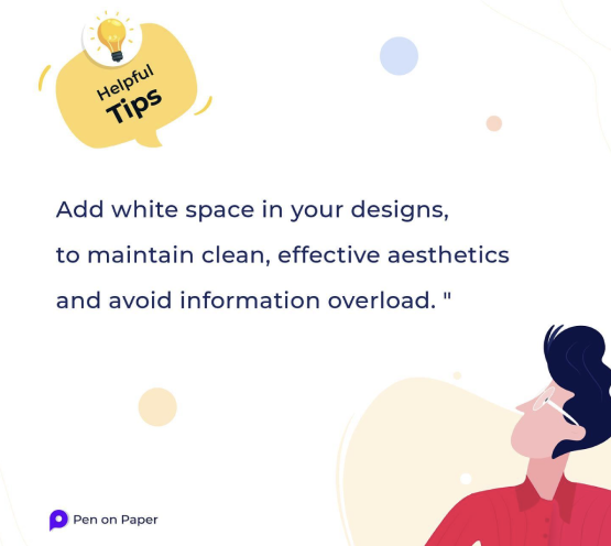
6. Use White Space as a Sculpting Tool
White space — or negative space — is actually just another tool used to fill the real empty canvas, and great designers know this.
"White Space can create the visual stream by pulling in or repelling attention, increases readability and gives elements some breathing room for better comprehension."
Incredible designers have been exploiting white areas since Ancient Greeks were “designing” painted vases. Don’t be afraid to leave parts of the screen empty — rather, consider removing some elements to create more empty spaces in your UI design.
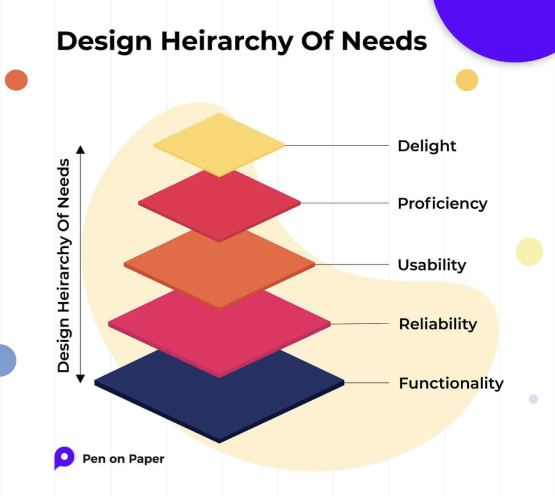
7. Maslow’s Hierarchy of Needs
Maslow’s famous hierarchy of needs has been adapted to
represent the needs of a user.
Human beings must satisfy the needs like food and air
before they tackle more complicated ones like social
acceptance.
"Users must feel secure in areas like functionality and comprehension, before considering the fun factor of a UX design."
Great UI UX designers fulfill these necessities, from the base up. Firstly, a site must function, or else all other features are irrelevant. Next, the site must be reliable, meaning it functions with consistency so that the user takes time to learn the system (and doesn’t need to relearn it).
Then, a site must be usable, meaning it functions well,
and in an intuitive way that feels natural to the user.
Last, however regularly missed, the site must be
pleasurable: aesthetic, invigorating, and capable of
creating emotional connections.
8. Remember Appearance Affects Functionality | UI Design | UX Design
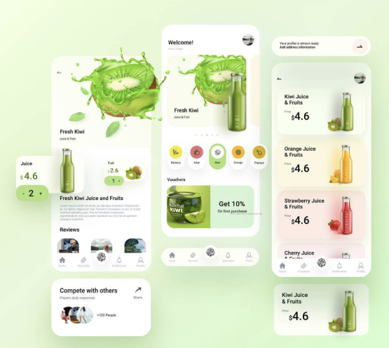
Though it may sound superficial, in the realm of UI UX designing, it’s what’s on the outside that counts. Appearance accomplishes more than cause the user to go “that looks nice.” According to Don Norman, an aesthetically-pleasing site actually relaxes the user.
"Visual relaxation has a physiological effect on the brain that facilitates learning, decision-making, and the mechanical functions required to interact with the site."
Furthermore, a website’s appearance directly affects the emotional connection it creates with the user. Your selection of hues, design, style, and kinds of graphics will all either charm or spurn your user. Off course functionality and usability are necessary as well, but still a visual makeover can go a long way.
9. The Power of Emotional Connections | UI Design
"The emotional connection a user feels towards the site will most often dominate their overall opinion about it. User feedback is a conversation between the user and the interface itself."
Great designers pay attention to this, and fabricate a UI design for the whole system. If user feedback is ignored, the conversation becomes too one-sided. An incredible UI designer finds harmony between the two, drawing on their empathy with the user to understand what they’d prefer. Along these lines, user input causes the whole interaction to appear to be increasingly “human.”
UI Design with excellent feedback stand out in the users’ mind and are remembered days later, while lacking interactions will soon be forgotten — much like conversations at a cocktail party.
10. Don’t Underestimate Copywriting
Good designers work in conjunction with copywriters. Just as feedback is your side of the interface’s dialogue, your copy- writing reflects your site’s personality, for better or worse.
"It doesn’t matter so much how you sound, as it does that how your tone matches how you want to convey yourself." A happy, easygoing, and even hilarious tone may work great for a social media tool but may not work for an investment firm.
If you are outsourcing your copywriting, try to avoid lorem ipsum when iterating on UX design. Incorporate the copy in at the earliest opportunity. This will empower you to design while considering the real content, both the tone of the content, and the actual size and typography.
Conclusion:
In this blog, we have covered the essentials that a beginner needs to know about UI/UX design. By understanding how things look and work, you will be able to create user interfaces and user experience that are user friendly and engaging. Make sure to read through the blog and learn everything you need to design user interfaces that work!

January 23, 2023
January 23, 2023